Results and visualization
The output of the analysis are two csv files. One large file containing data for each geolocated settlement and one smaller file with summarized data. Additionally, there is a file that lists the key input variables used in the scenario.
Output parameters
The following table displays the parameters included in the excel file that includes all the grid cells. The first 18 parameters come from the input csv file while the remaining stem from running the Python code.
Variable |
Unit |
Description |
|---|---|---|
Country |
Name of the country |
|
Admin_1 |
Admin level 1 (state/region/province) name |
|
X_deg |
degrees |
Longitude |
Y_deg |
degrees |
Latitude |
GridCellArea |
sq. km |
Area of population settlement |
Id |
indicator |
ID given to each cluster |
Pop |
people |
Population in each cluster for the start year as given by the GIS dataset |
NightLights |
nW cm−2 sr−1 |
Values of light intensity |
GHI |
kWh/km² |
Solar irradiation (usually in the range of 1,500–2,500) |
WindVel |
m/s |
Average annual wind speed |
Travelhours |
hours |
Time in hours to travel to the nearest town of more than 50,000 people |
SubstationDist |
km |
Distance to nearest substation |
RoadDist |
km |
Distance to nearest road |
CurrentMVLineDist |
km |
Distance to nearest existing MV line |
PlannedMVLineDist |
km |
Distance to nearest existing or planned MV line |
CurrentHVLineDist |
km |
Distance to nearest current HV line |
PlannedHVLineDist |
km |
Distance to nearest existing or planned HV line |
HydropowerFID |
indicator |
ID of nearest potential hydropower site |
Hydropower |
kW |
Small-scale hydropower potential of nearest site |
HydropowerDist |
km |
Distance to nearest potential hydropower site |
TransformerDist |
km |
Distance to nearest service transformer (MV/LV) |
IsUrban |
0 = rural, 2 = urban |
Urban/rural split assigned in the calibration algorithm |
ResidentialDemandTierCustom |
kWh/household/year |
Indicative residential electricity demand target |
PerHouseholdDemand |
kWh/household/year |
Indicative residential electricity demand target |
HealthDemand |
kWh/year |
Indicative electricity demand for health facilities |
EducationDemand |
kWh/year |
Indicative electricity demand for educational facilities |
AgriDemand |
kWh/year |
Indicative electricity demand for agricultural processes |
CommercialDemand |
kWh/year |
Indicative electricity demand target for commercial activity |
WindCF |
% |
Estimated capacity factor for wind technologies |
PopStartYear |
people |
Population in the base year of the analysis |
ElecPop |
people |
Population assumed to have access to electricity |
ElecPopCalib |
people |
Calibrated version of ElecPop at the start of the analysis |
Pop20XX |
people |
Projected population in the year |
ElecStart |
0–1 |
Electrification status at start of analysis |
GridDistCalibElec |
km |
Distance to nearest grid element after calibration |
FinalElecCode20XX |
0–99 |
Code defining technology providing electricity in base year |
ElecPop20XX |
people |
Population assumed to have access to electricity in the year |
ResidentialDemandTierX |
kWh/hh/year |
Indicative residential electricity demand target equal to Tier X |
NumPeoplePerHH |
people |
Number of people per household |
NewConnections20XX |
people |
Households that need to be electrified in the year |
EnergyPerSettlement20XX |
kWh |
Estimated electricity demand target in the settlement |
MG_Hydro20XX |
USD/kWh |
LCOE for mini-grid hydro |
MG_PVHybrid20XX |
USD/kWh |
LCOE for mini-grid PV hybrid |
MG_Wind20XX |
USD/kWh |
LCOE for mini-grid wind hybrid |
SA_PV20XX |
USD/kWh |
LCOE for stand-alone PV (SHS) |
Minimum_Tech_Off_grid20XX |
Least-cost off-grid technology |
|
Minimum_LCOE_Off_grid20XX |
USD/kWh |
Minimum off-grid LCOE |
OffGridInvestmentCost20XX |
USD |
Investment cost for minimum off-grid technology |
Grid20XX |
USD/kWh |
Grid LCOE |
NewGridExtensionDist20XX |
km |
Grid extension distance |
MinimumOverall20XX |
tech abbreviation |
Technology abbreviation in the step year |
MinimumOverallLCOE20XX |
USD/kWh |
LCOE of the least-cost technology |
MinimumOverallCode20XX |
1–7 |
Code defining least-cost technology |
InvestmentCost20XX |
USD |
Total investment required |
InvestmentPerConnection20XX |
USD/capita |
Estimated investment per connection |
ElecStatusIn20XX |
0–1 |
Final electrification status |
NewCapacity20XX |
kW |
Additional capacity required |
TotalEnergyPerCell |
kWh/year |
Total electricity demand in settlement |
Tier |
1–5 |
Tier classification of consumption |
Technology20XX |
Technology used or “unelectrified” |
|
AnnualEmissions2030 |
kg CO₂ eq./year |
Estimated new emissions from new connections |
Summaries output
The values in the summaries file provide summaries for the whole country/study area.
Variable |
Description |
Unit |
|---|---|---|
Population |
The population served by each technology in the year. |
people |
New Connections |
The number of newly electrified households by each technology in the year. |
households |
Capacity |
The additional capacity required by each technology to fully cover the demand in the year. |
kW |
Investment |
The investment required by each technology to reach the electrification target in the year. |
$ |
Visualization of Electrification Results in GIS
All images in this section are screenshots from QGIS 3.10 and QGIS 3.40, which are licensed under Attribution-ShareAlike 3.0 Unported (CC BY-SA 3.0), unless stated otherwise.
This section provides a guide to the basic steps required to visualize the results of an OnSSET electrification analysis in a QGIS environment. Please follow the step-by-step process below. If you have further questions, you can use the OnSSET forum for support.
Part 1 – Visualizing Results
Step 1. Importing the CSV Results File
After running your OnSSET analysis, you will obtain a .csv file containing the results. If this file is imported directly into a GIS environment, it will appear as a point layer.
However, for visualization purposes, it is usually preferable to display the results using the population clusters that were used in the analysis. The steps below explain how to join your results file to the cluster layer.
Import the CSV file
In QGIS, go to:
Layer → Add Layer → Add Delimited Text Layer
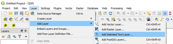
Add Delimited Text Layer dialog in QGIS.
In the dialog window:
Under File format, make sure CSV (Comma separated values) is selected.
Verify the preview of the file at the bottom of the window.
Set the coordinate system and geometry:
Geometry CRS: WGS84
X field: X_Deg
Y field: Y_Deg
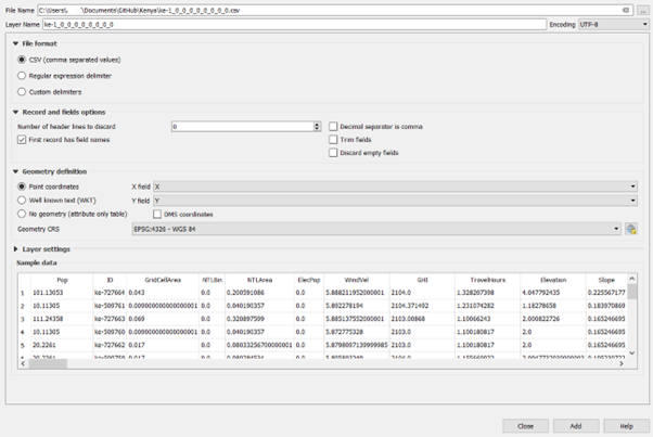
Click Add to load the layer.
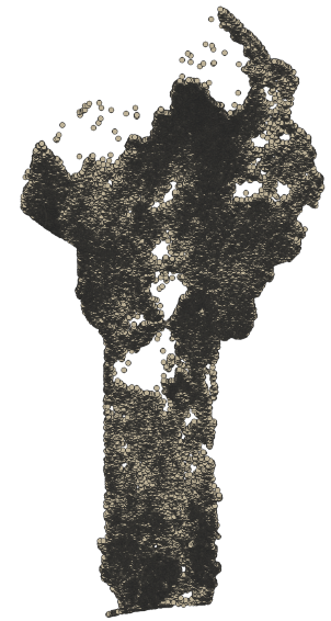
CSV results file displayed as a point layer.
Once loaded (this may take some time), the layer should appear in the Layers Panel at the bottom-left of the screen.
Add the population cluster layer
Add the cluster layer that was used as the population layer during the extraction process:
Go to Layer → Add Layer → Add Vector Layer, or
Drag and drop the cluster file directly onto the map canvas.
Join the results to the clusters
To merge the results with the population clusters:
Open the Processing Toolbox.
Search for the tool Join Attributes by Field Value.
Configure the tool as follows:
Input layer: Population clusters
Table field: id
Input layer 2: Results CSV layer (e.g. Scenario_1_Results)
Table field 2: id
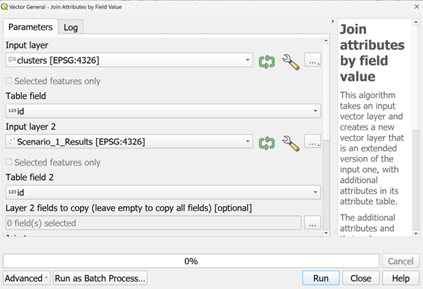
Configuration of the Join Attributes by Field Value tool.
Click Run.
A new layer will be created with the geometry of the clusters and the attributes from the CSV file.
Step 2. Displaying Useful Information in QGIS
At first, the joined layer will not convey much information visually. This can be improved using Symbology settings.
Categorized symbology
Right-click the joined layer in the Layers Panel and select Properties.
Open the Symbology tab.
Change the rendering type from Single symbol to Categorized.
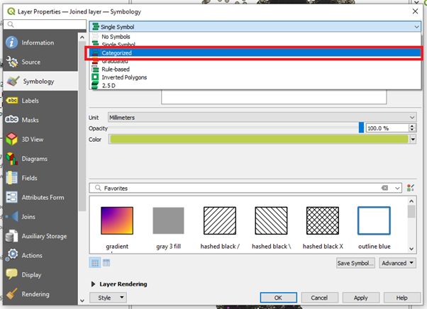
Categorized symbology configuration.
For Value, select:
Technology20XX
(Replace XX with the year of interest.)
Click Classify to display all technology options used in the results.
Note
For a description of the output columns, see the Output Column Description above.
Note
Categorized is typically useful for visualization where there are a smaller number of distinct values, e.g. the choice of least-cost technology. For information that can take any value in an interval, e.g. Investment cost, Graduated is more suitable
Adjusting symbol appearance
To improve readability:
For each technology class, click the colored symbol.
Select Simple fill.
Set Fill color and Stroke color to the same value.
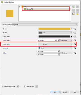
Adjusting fill and stroke colors.
Suggested color scheme
To match the Global Electrification Platform (GEP) color conventions, the following color codes are recommended:
GEP Code |
Least Cost Technology |
Suggested Color Hex |
|---|---|---|
1 |
Existing grid |
#4e53de |
2 |
Grid extension |
#a6aaff |
3 |
SHS |
#ffc700 |
5 |
PV hybrid mini-grid |
#e628a0 |
6 |
Wind hybrid mini-grid |
#1b8f4d |
7 |
Hydro mini-grid |
#28e66d |
99 |
Unelectrified |
#808080 |
Click Apply to render the map.
Part 2 – Creating Map Layouts
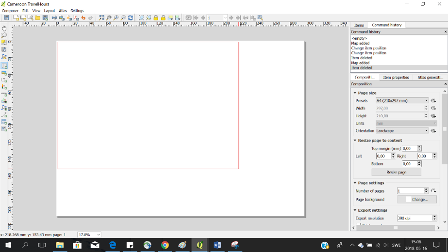
Creating a print layout
Open the Print Layout view:
Project → New Print Layout
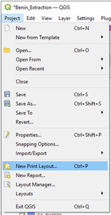
Creating a new print layout.
Enter a name for the layout and click OK.
Page setup
From the Layout menu, select Page setup.
Set:
Page size: A4
Orientation: Portrait or Landscape depending on the shape of your study area
On your left-hand side you have a number of different tools that you can use for opening maps and preparing your map
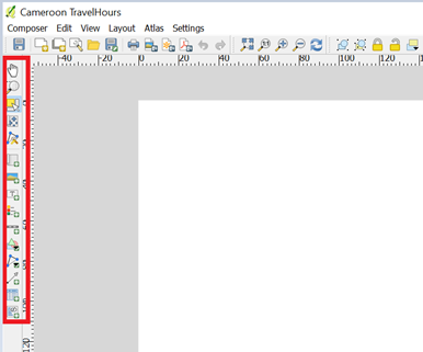
Adding the map
Select Add new map from the left-hand toolbar.
Click and drag on the page to define the map area.
Adding a map to the layout.
Editing layout items
Each item (map, legend, title, scale bar) can be edited via the Item Properties panel.
Editing layout item properties.
Add and arrange:
Title
Legend
Scale bar
Exporting the map
Export the map as an image and save it on your computer.

Exporting the map layout.